
Is A Really Bad Logo Worse For A Company Than No Logo?
Your name and your logo are the essential seeds of your brand identity. No brand strategy can really get off the ground without these essential elements of identity. Start-ups need to build the brand foundation to power the growth-stage company they will one day be.
Your brand is your most powerful behavior change tool. If you’re disrupting a category, building a new one, promoting a new way of doing things, building subscriptions, memberships, community or a habit, then you’re in the business of behavior change.
Branding for behavior change is different. It’s tools for the present and tools for the long road, for each stage of the customer journey.
That said, it hard for me to imagine “no logo.”
Of course, the company will have a name. If the company has a name, you will need to represent the name in some way. Anyway you choose to represent the name will appear as “the logo.”
If you don’t designate a way of representing the name then you might use whatever typeface you’re working in at any given time to represent the logo.
Apple. Think different.
Nike. Just do it.
DiMassimo Goldstein. Inspiring Action.
This variability will be, in effect, your logo. And, it’s pretty bad.
So, then the question is – what would be worse? A good way to begin to think about this is to think of the strengths of this particular approach to the logo.
For one thing, it’s readable.
An unreadable logo would be worse, especially if the brand wants to stand for clarity, simplicity or ease-of-use.
Apple’s use of the apple icon with the bite out of it isn’t unreadable. We say it’s “iconic” precisely because people look at it and immediately think Apple. Not everyone, of course, but enough people do.
Same goes for Nike’s Swoosh.
The approach to the logo above also has the strength of feeling appropriate for the context it’s in. On the other hand it doesn’t stand out, but blends in.
Kim Kardashian. Nothing to see here.
Blending in is a brand value for some companies, but not for others.
Another thing you can say for the variable Zelig (the Woody Allen character who took on the appearance, dress and behavior of whoever he was with) logo is that it is not especially ugly or stupid or crass or inappropriate.
Diesel. bE sT0oPid
Diesel actually had a successful “Be stupid” campaign. The idea: smart is boring; stupid is more fun. A stupid logo might make sense for them, but would be an absolute disaster for Wells Fargo.
Wells Fargo. sTuPid in LoVE wITh yOUr MoNEy
I would propose that you start out with a good-enough logo.
I started my own company with DiMassimo Inc. as the name, using the Courier typeface that used to be associated with typewritten material. It was the mid 1990s and the world was full of wild, pixelated, digital-influenced type faces, so I thought that Courier said that we didn’t need any flash or pretense – in short, it showed confidence.
It worked well enough until we had a better logo and identity designed.
Apple started as Apple Computer Co. They didn’t have such a great logo.
![]()
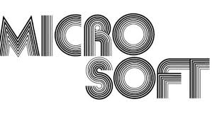
Microsoft’s first logo was OK…
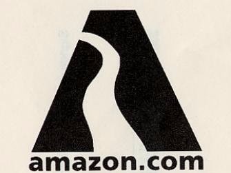
Amazon’s first logo was no great shakes…
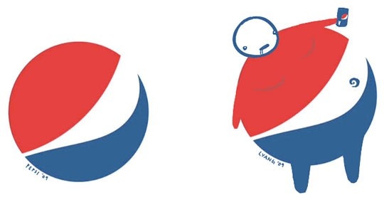
But there is such a thing as a truly awful logo. Some people think Pepsi’s logo is not so great:
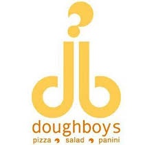
Doughboys Pizza has cleaned up its logo since this one. I know what you’re thinking – no, with a designer!
Also, today it’s important to make sure your logo isn’t offensive in and outside your own borders and culture. This one from Locum in Sweden is particularly unfortunate.
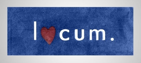
I tried hard to confirm this last one because it’s a pretty unbelievable fail. From all I can find it appears real, although it may have been a company holiday card design rather than an all-year logo. The company currently has a more regular typographic mark, which now looks more like I o cum. So, better.
Now, you know a firm with just this specialization, because you know our name and you know our logo.
![1_HF_Graphis_Mockup_Blog[1]](https://digobrands.com/wp-content/uploads/2017/01/1_HF_Graphis_Mockup_Blog1-1024x588.jpg)
![3_HF_GraphisBlog_Apron[1]](https://digobrands.com/wp-content/uploads/2017/01/3_HF_GraphisBlog_Apron1-1024x582.jpg)