Rebrand
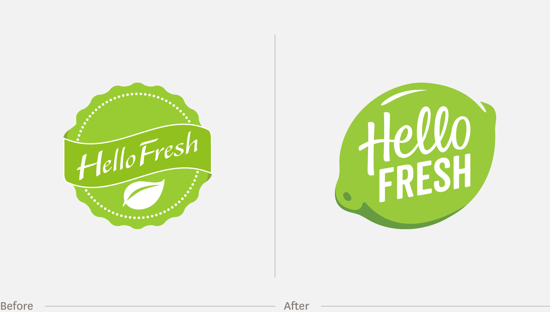
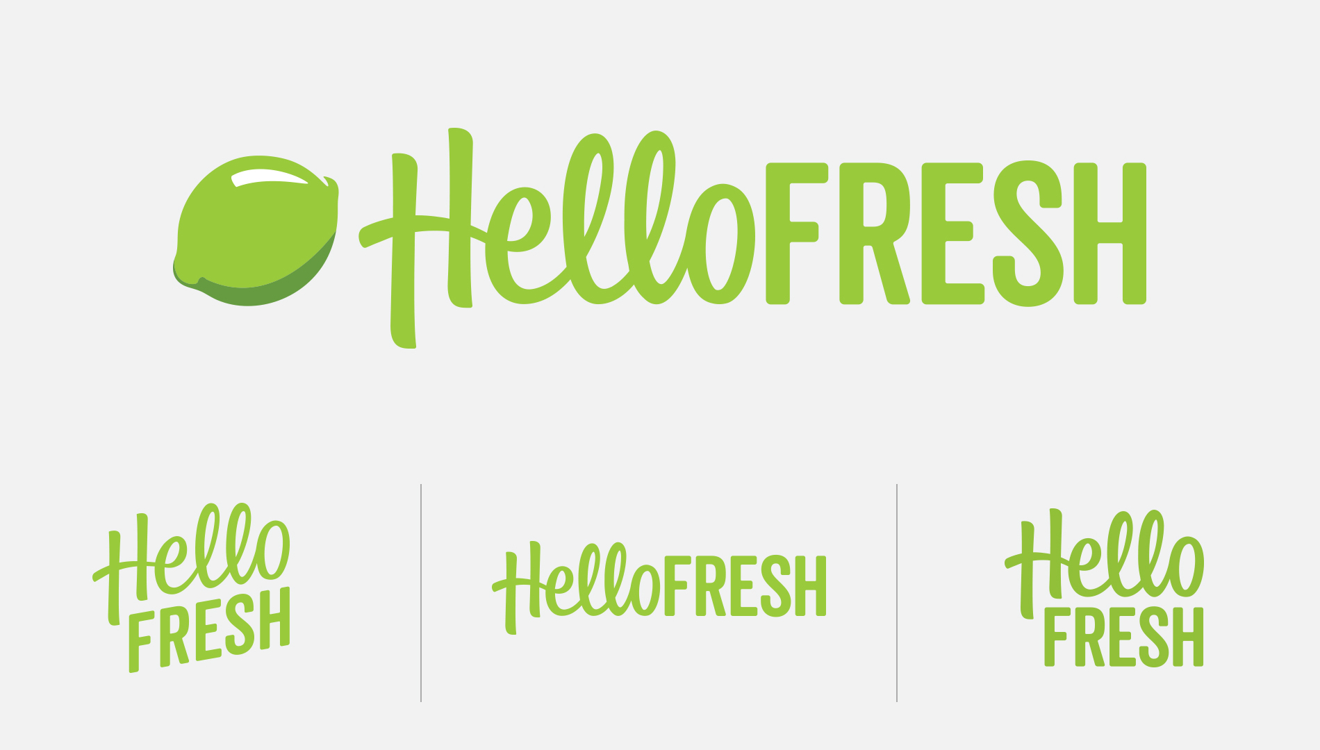
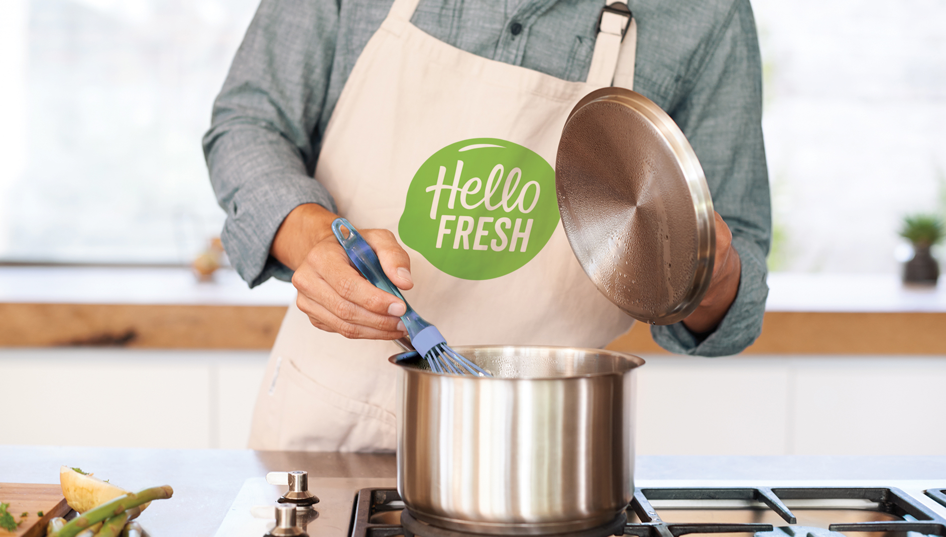
When we put their logo on the same page as their competitors, the problems were quickly apparent. It didn’t jump out of the lineup. The type was hard to read. The shape was generic. And the only ownable mark said “leaf,” when it should have said “food.” It also lacked a consistent solution for horizontal spaces and living over photography.
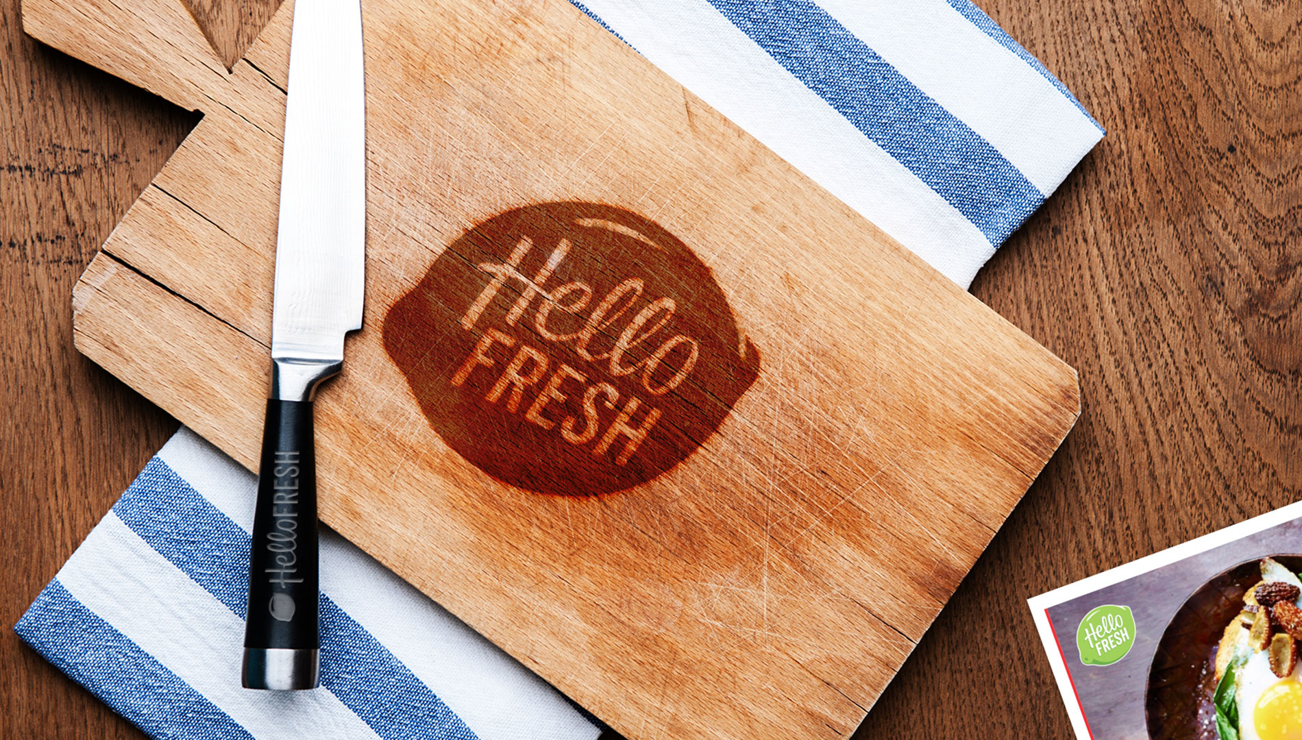
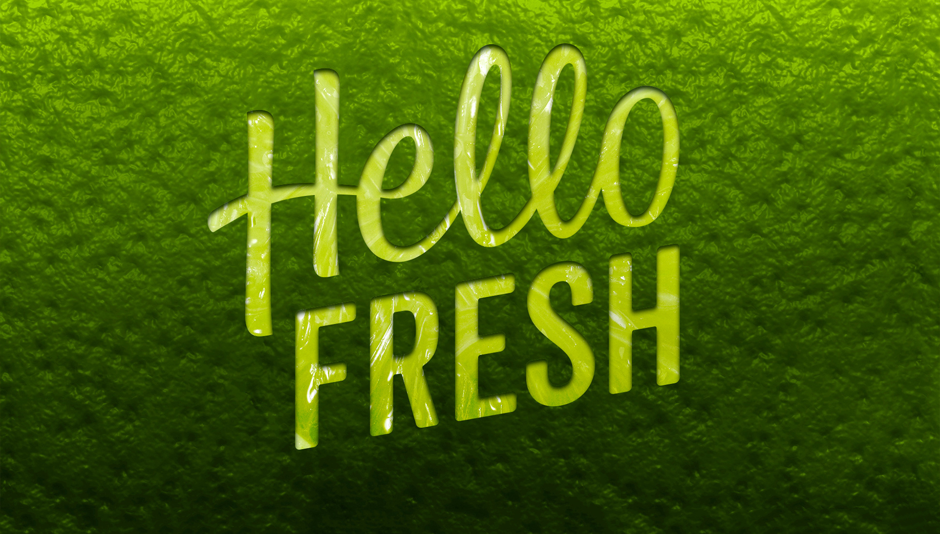
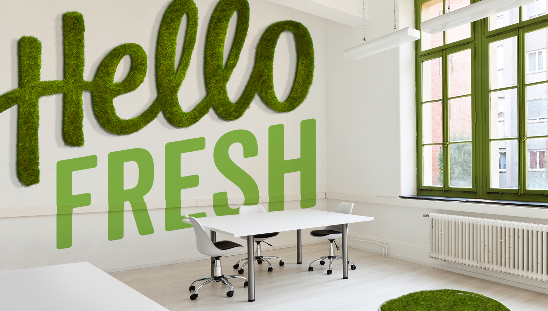
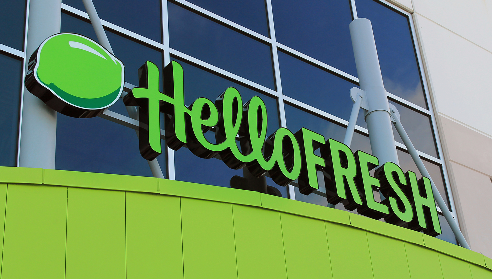
The round shape and green color were already recognized, so we aimed to maintain that equity. To address the legibility, we started by stacking the words Hello and Fresh. This used the circular space more efficiently and increased type size by 47%. To draw emphasis on Hello, the most ownable part of the name, we introduced a friendly hand-drawn typeface. For Fresh, we applied an engineered font reminiscent of vintage farm signs to express that freshness and quality are fundamental. Setting the word mark at an upward angle created a distinctive positive energy and excitement.
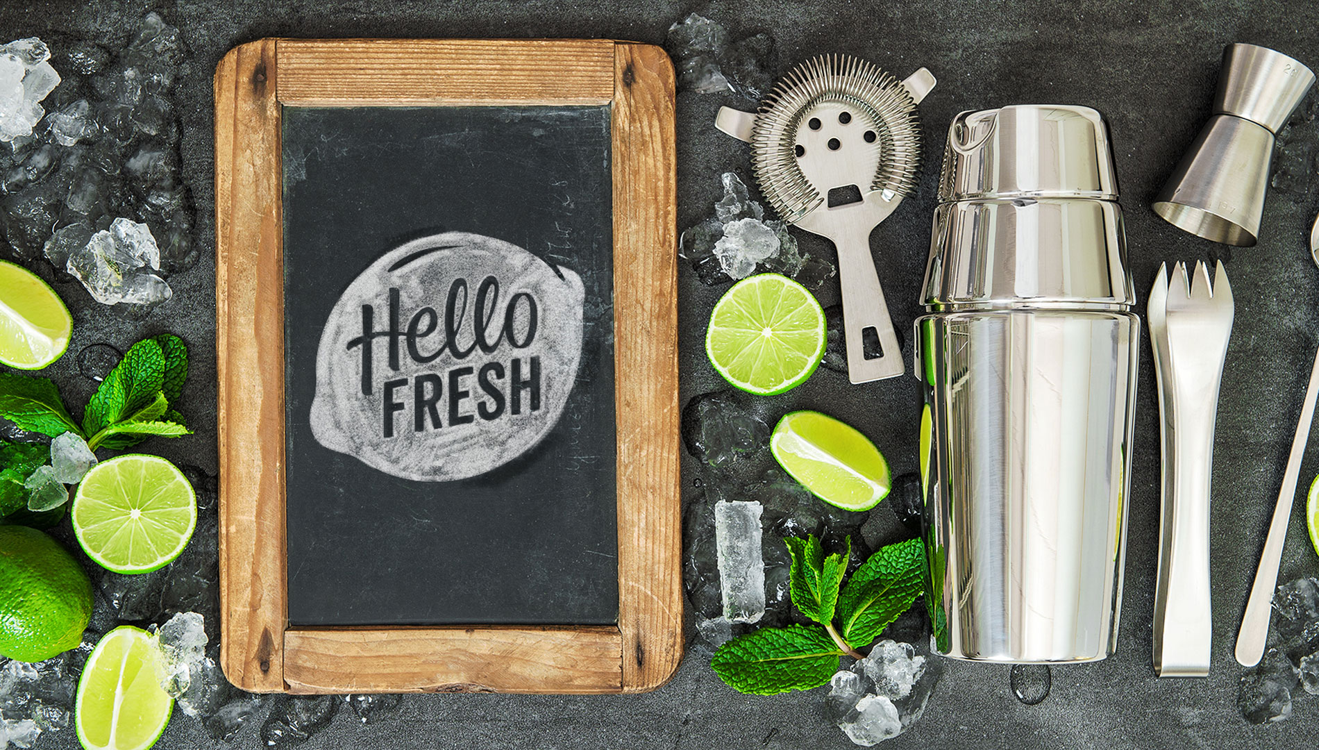
And most notably, we transformed the recognizable round shape and green color into a lime, giving the new logo a zesty flavor.
The identity won the Silver Award in the Graphis Logo Design 9 Competition.