Creative people hate tools they view as uncreative, and the word “stock” smacks of satisficing sameness.
Yet, not all creative asset companies are created equal.
While art directors, designers, and creative directors have been challenged with lower budgets, canceled shoots, and tighter schedules, many avoided “stock” sites and services for fear of stock sameness.
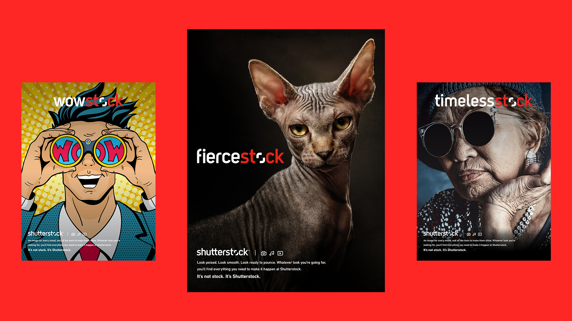
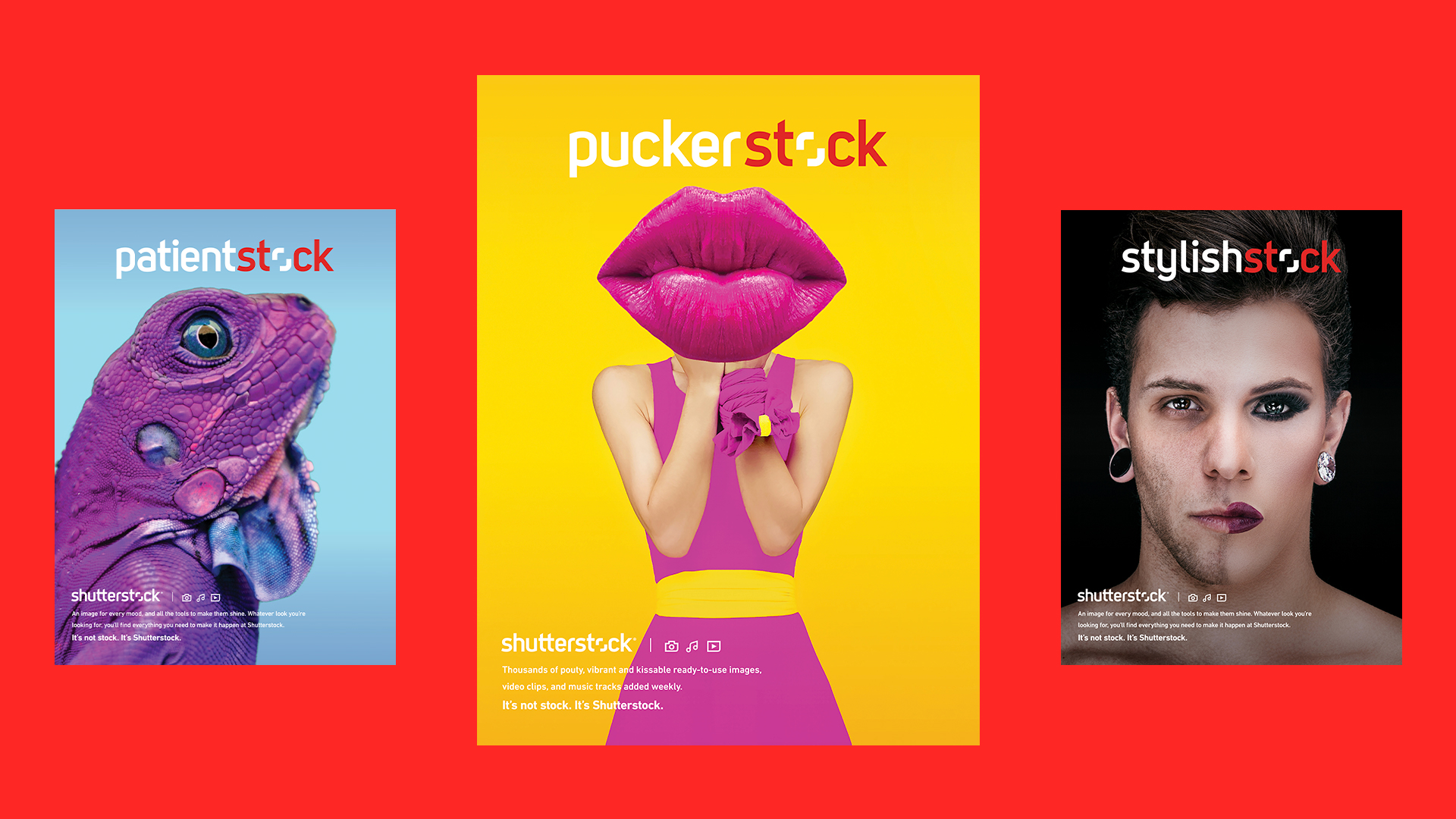
DiGo client Shutterstock had built something very different – a great set of tools for enhancing creativity, and a remarkable range of assets that seemed to be anything but “stock.”
Since most of the budget would go into connecting creators, we’d need to hijack news and memes to get our message out. The Fyre Festival fiasco presented us with our first opportunity. Within 72 hours, using $2000 of Shutterstock assets, we created a video that was ultimately seen by millions – nearly 700,000 on YouTube alone. Though it was not a SuperBowl commercial, since it did come out during SuperBowl season, one subtheme of comments was, “Shutterstock wins the SuperBowl with Fyre Festival Video.”
The theme of our winning campaign: It’s Not Stock. It’s Shutterstock.
Challenge
The creative tools and content at Shutterstock unlock potential, freeing creative people to realize their best ideas. However, our research showed that a mental-behavioral block was preventing most creative people from enjoying these benefits.
Desired Positive Behavior Change
From closed-rigid-creativity to open-nimble-creativity measured by increasing engagement, usage, and revenue-per-creative person on Shutterstock.
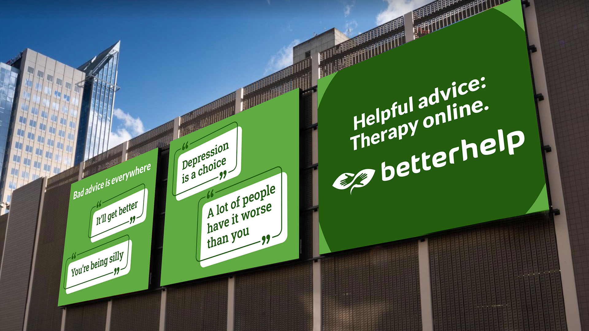
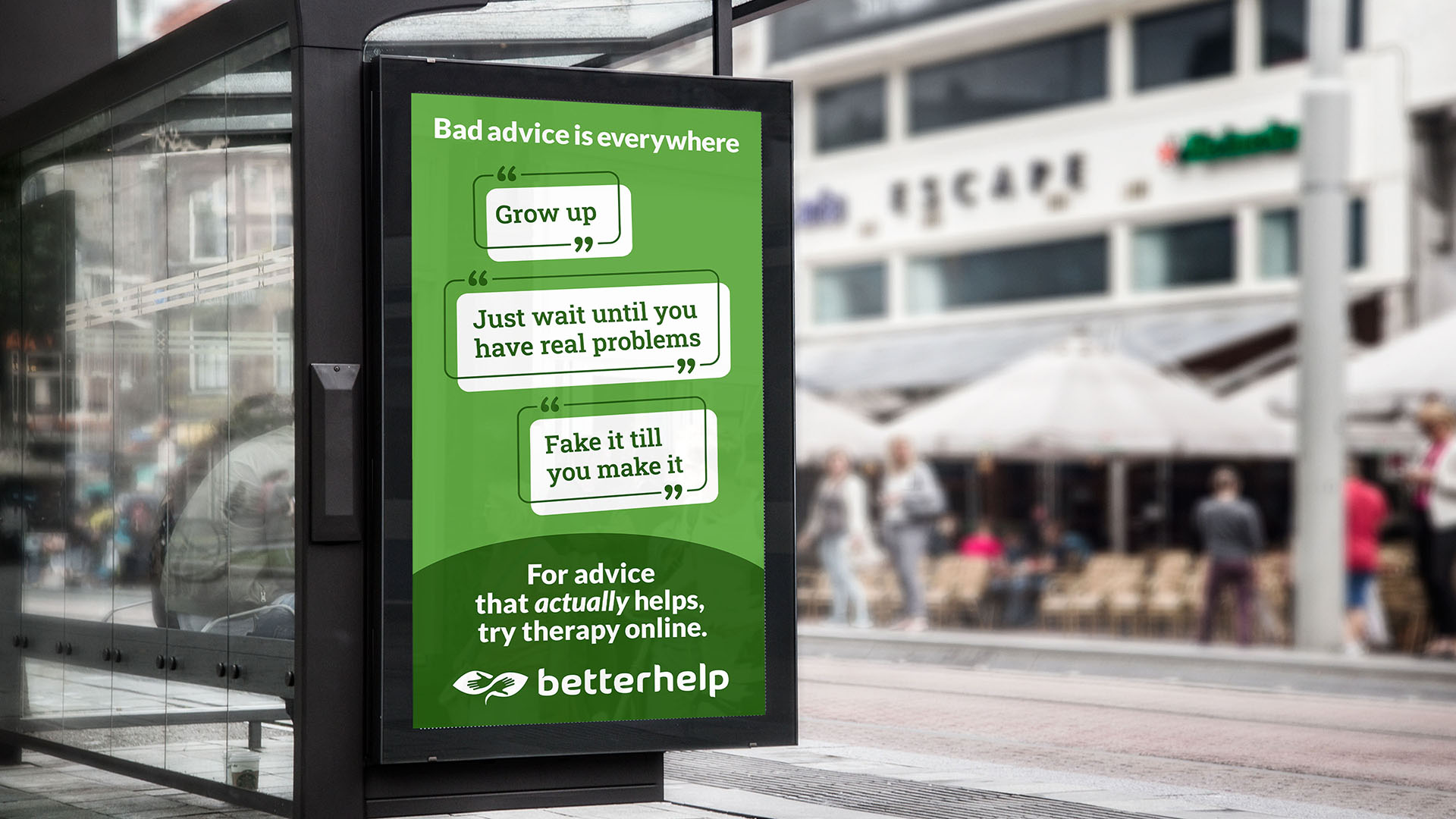
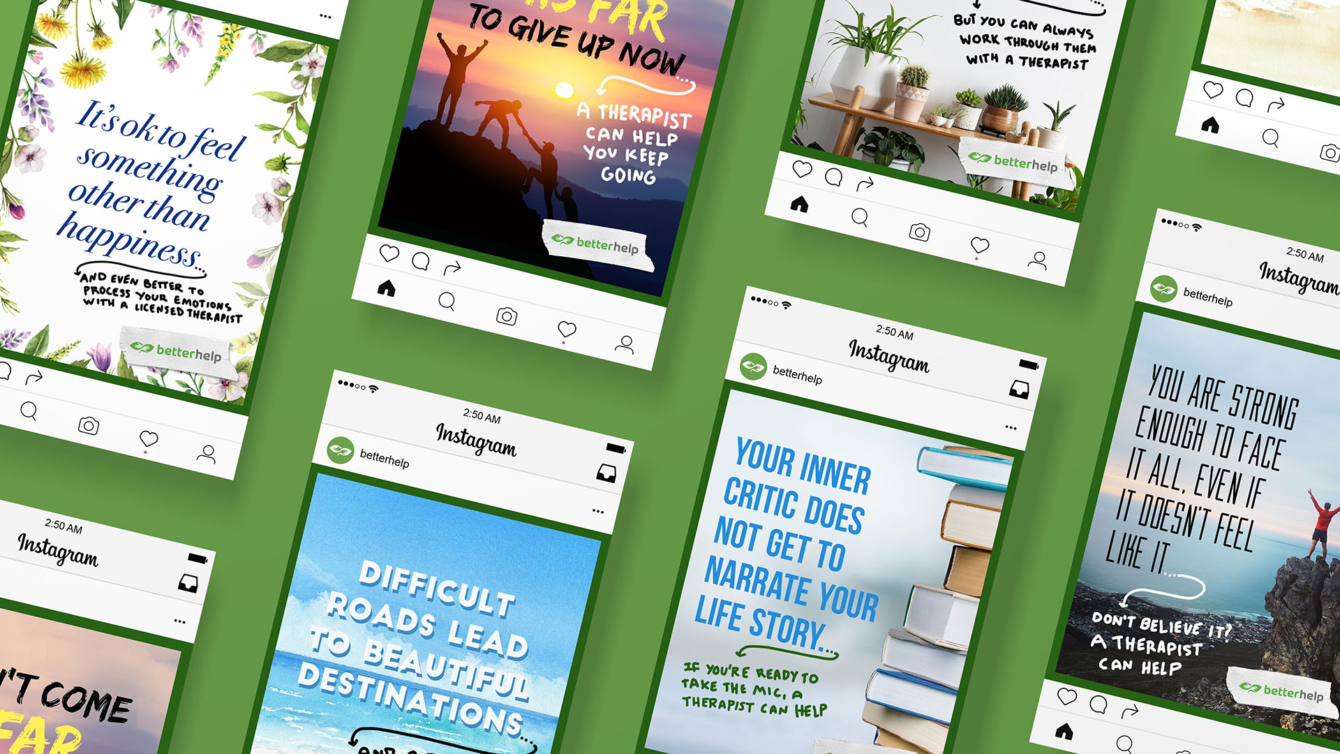
BetterHelp reached out to DiGo to change behavior and get more people into therapy.
The largest therapy brand in North America, BetterHelp’s commitment to address America’s behavioral and mental health crisis exceeds even their market share.
In fact, the problem was so big that taking market share wouldn’t solve it. Less than half of the people who need therapy actually get it. The only way to get many more people the better help they need is to change behavior on a massive scale.
Doing this started with a business analysis and identifying the behaviors that would drive impact and value. Many more people would need to try therapy through BetterHelp.
Through our 3M’s Behavior Change Marketing process, we discovered a key insight that unlocked motivation and inspired action:
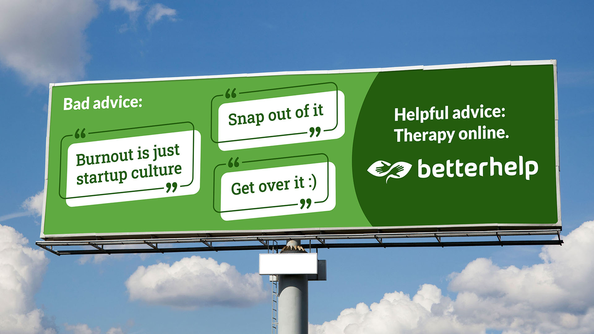
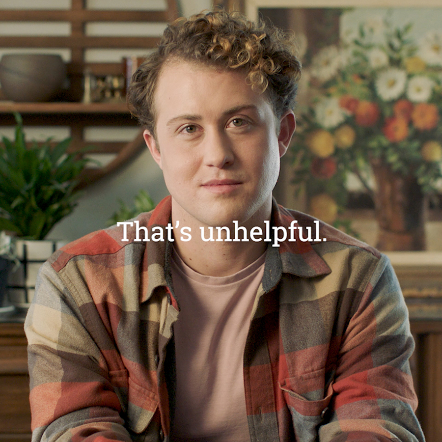
People suffering from anxiety or depression also suffer from a lot of bad advice.
While much of the advice the target audience was enduring was well-meaning, it made a lie of the notion that non-professional care could address these painful conditions.
Challenge
Less than half the people who need therapy actually get it. BetterHelp is the largest therapy brand in North America. The way they grow their impact is to grow therapy. They asked DiGo to help them crack this challenge, so we did.
Desired Positive Behavior Change
From relying on the well-meaning but poor advice of non-professionals and white-knuckling it alone to getting better in therapy. This adds up to millions of more people taking advantage of professional psychotherapy.
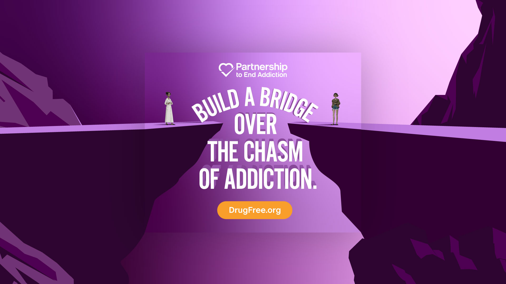
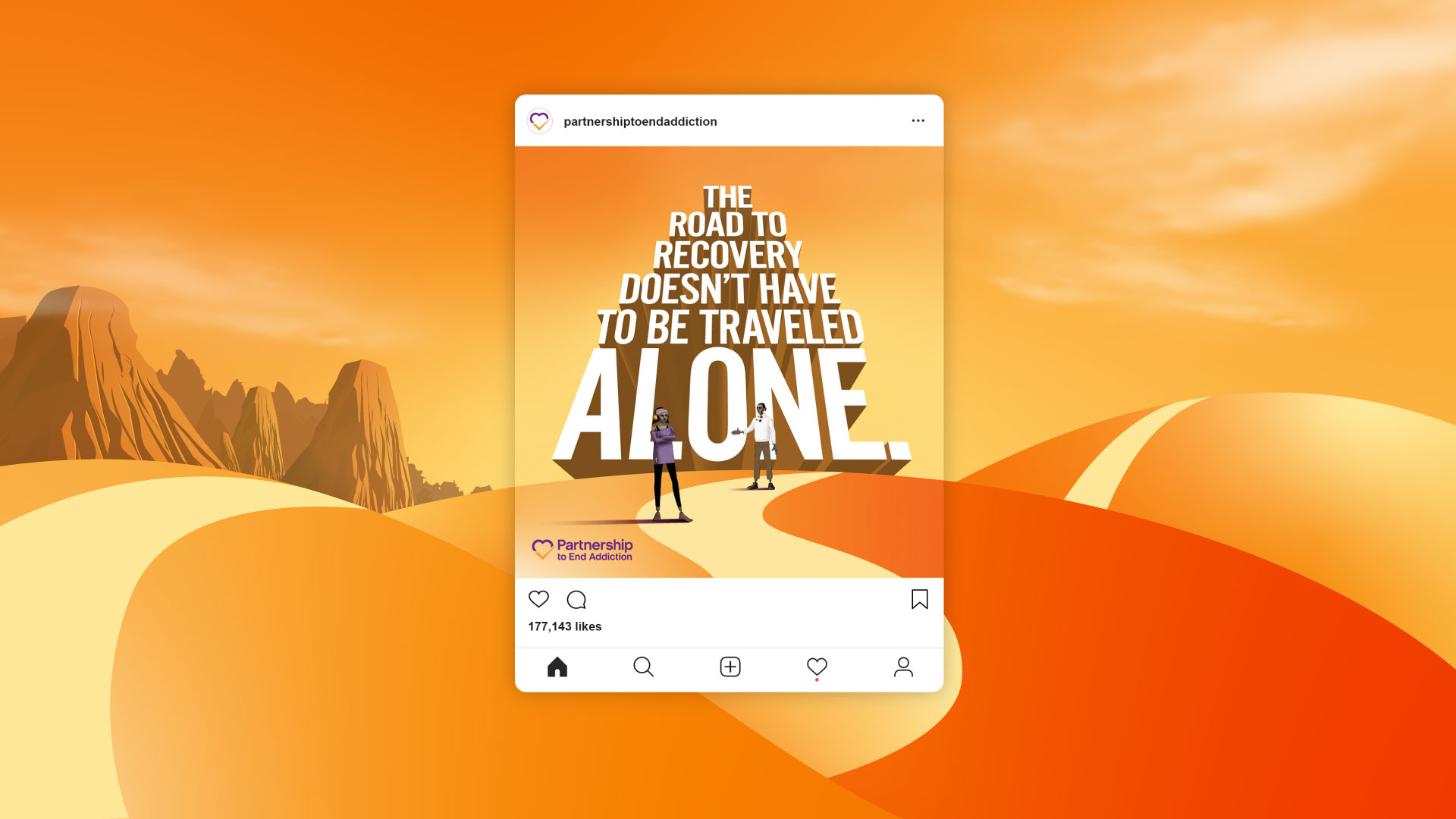
From “This is your brain on drugs” to “To end addiction, start with connection.”
Over 25 years, we helped the Partnership evolve as the nation’s drug misuse and addition challenges evolved.
Partnership for a Drug-Free America was the largest single-issue public service advertising campaign. A later iteration, Partnership for Drug-Free Kids helped hundreds of thousands of families. Throughout this history, DiGo had a front-row seat for some of the most consequential behavior-change marketing experiments of the 21st Century.
In 2018, Partnership for Drug-Free Kids and CASA (the National Center on Addiction and Substance Abuse) merged, and we helped create a new strategy and lead the process of creating a new identity – the Partnership to End Addiction.
It was an identity with a “moon shot.” The bold mission to end addiction as a public scourge was embedded in the name, signaling an extraordinary level of commitment.
Challenge
After guiding the Partnership through the creation and launch of their new identity, we faced a mental health crisis in America together. Our job was to get their proven family-based solutions used by many more families.
Desired Positive Behavior Change
From fearfully disconnected to confidently connected, as measured by dramatic growth in the use of the Partnership’s digital and human-to-human services.
Positive Behavior Change Idea
Ending Addiction Starts With Connection.
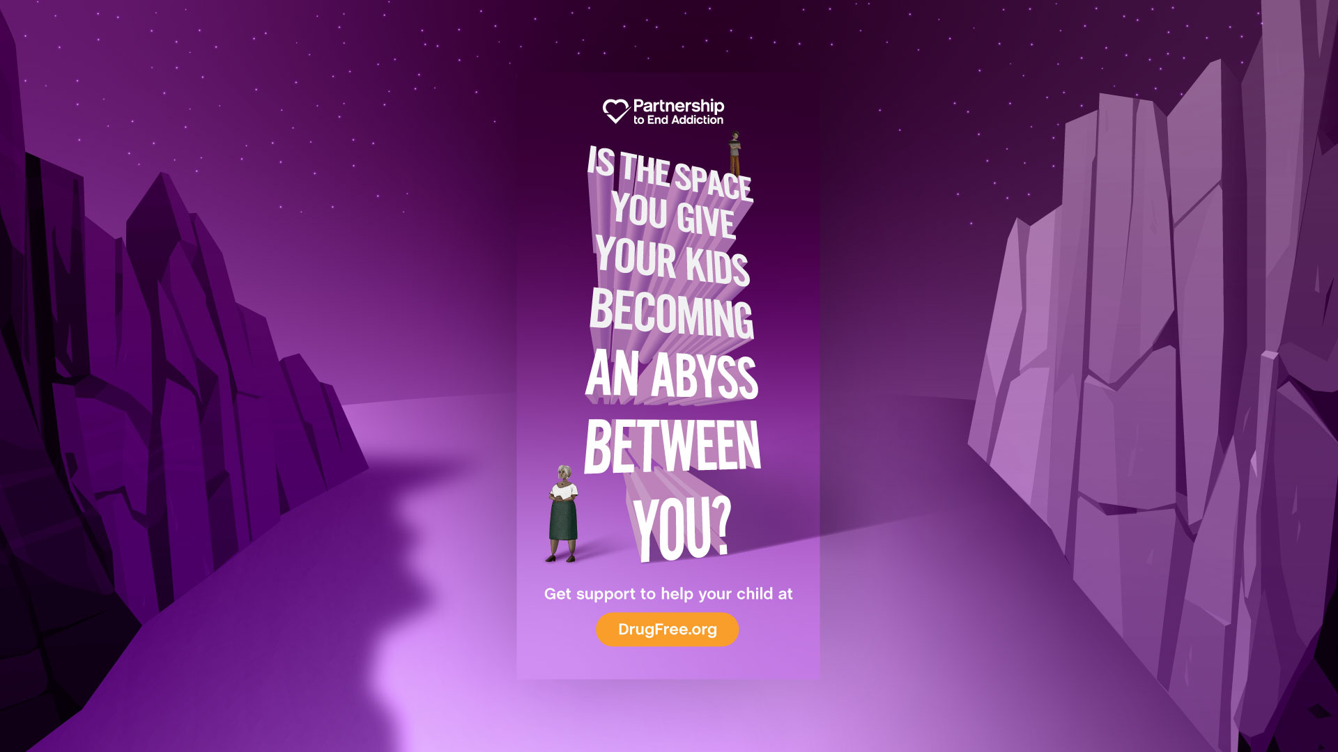
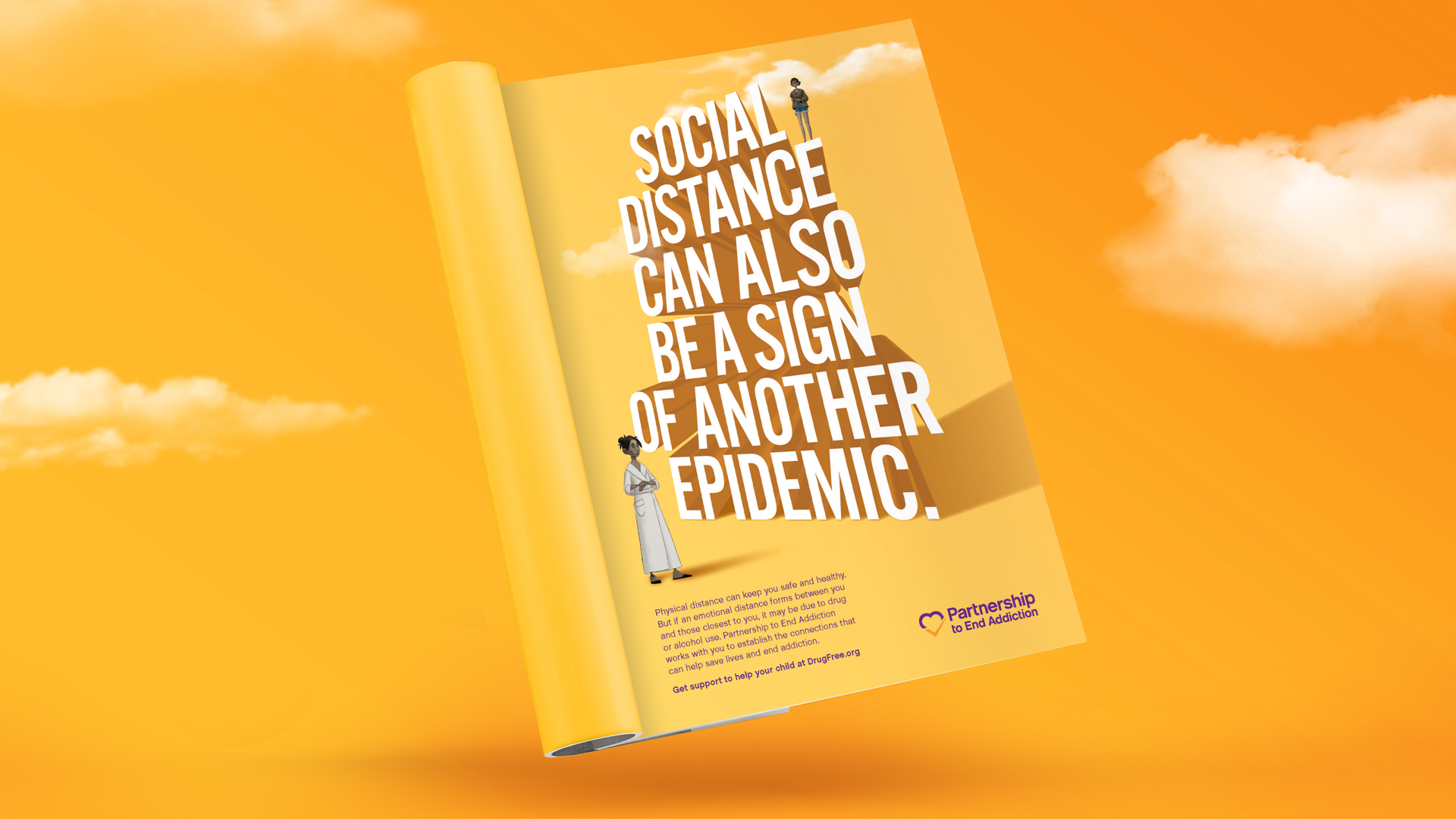
Suddenly, a global pandemic was sucking up all the attention. Perhaps you’ve heard of it? But something was growing underneath. A mental health and addiction crisis. Families driven suddenly together began to notice things that had been hidden by normal life. In other homes, isolation accentuated problems or incubated new ones.
Naming another crisis wasn’t going to help. Where hope is invisible, denial is invincible.
The behavioral scientists and parent coaches at the Partnership knew a hopeful secret and we decided that our job was to get it out there.
We needed to speak directly about the relationship between young adults and the adults who love them.
Our message, “To end addiction, start with connection.”
We faced a novel set of production challenges that we decided to transform into blessings. Unable to shoot, we shifted our creative attention toward the emotive potential of animation.
Working with Bonfire, we create emotional stories of alienation and connection, accentuated by gorgeous music from The Lumineers.
The results exceeded all expectations. We made hundreds of thousands of connections. We helped the Partnership change behavior and save lives.
For well over a decade, we have been honing our approach to behavior-change marketing.
Then, in 2021, we came together and decided, going forward, Positive Behavior Change would be our everything.
Of course, being a creative agency, we wrote a statement.
And of course, it is a positive one. Read it here:
If Ever There Was a Time For
A Positive Statement,
This Is It.
After more than 25 years of doing well, we all came together and decided to do only good.
We agreed to be guided by a single mission – to help change the behaviors that change lives for the better.
People don’t always do what they know they should. Much of marketing makes it worse. In this industry, too often we have worked on things we did not believe in.
Not anymore. Not here. If we can help anyone eat better, breathe easier, live longer, sleep smarter, learn faster, love deeper, feel mentally healthier, emotionally stronger, or financially more well, then we believe the investment will have been worth it.
DiGo is a community of people with diverse talents all committed to being agents of positive change. We champion the brands that help people make better choices and form more empowering habits. When they succeed, better things happen for us all – individuals, organizations, and the world we all share.
Helping everyone reach their potential is how we intend to reach ours.
There has never been a more important time for a positive statement.
“We can’t solve your problem because we haven’t done our strategic work yet.”
When I worked at other agencies, I always thought this to be the ultimate bureaucratic blindness.
Building the BRAND While We Build The BUSINESS.
This is the core promise of our agency, DiMassimo Goldstein. This is the experience our clients have bought when they’ve bought us.
Not: “First we’ll build the brand, then we’ll build the business.”
Not: “First we’ll build the business, then we’ll build the brand.”
Instead, we do both, and simultaneously. Like you do!
Sometimes this translates as “Building the brand while lowering the cost of acquisition.” Sometimes it’s “Building the brand while driving sales efficiency.”
Sometimes it’s just “Growing the business and the brand.”
Our clients never wait months to see returns from an agency engagement. We typically deliver measurable revenue within the first 30 days, and we don’t have to sacrifice future success to do it.
We call it two-track planning, and it’s implemented in everything we do. Imagine two columns on a page, the left titled URGENT and the right titled IMPORTANT.
Some urgent things are truly unimportant, but some we term “The Runway.” The board meeting coming up. The quarterly results reporting. The partner’s meeting.
If a plane doesn’t get aloft by the end of the runway, it doesn’t matter how good the food service and the movie was going to be. There are things you just need in the short run to make the long run possible. Often these things include results. That’s the Runway.
And, we don’t lose our strategic heads. We see the long-term opportunities in urgent problems. We see growth in behavior change.
And we manage them both, so that our clients can move forward, paying for tomorrow’s opportunities with today’s wins, all while strategically planting the seeds that ensure growth for the future in a time-starved world.
Yes, we build the brand. Yes, we build the identity and design the brand. Yes, we develop a theory of growth and build out a marketing plan. Yes, we develop advertising and content. Yet, we view all of this through a Behavior Change Marketing lens.
In short, behavior is where brand and business meet. Until someone acts, nothing changes. Until behavior changes, businesses don’t grow. Behavior is the intersection of meaning and emotion.
Every KPI in a business is driven by a Key Behavioral Indicator. Behavior drives results.
By keeping our eye on the behavior and the result, we see eye to eye with our clients as we accelerate value creation for the business.
Your name and your logo are the essential seeds of your brand identity. No brand strategy can really get off the ground without these essential elements of identity. Start-ups need to build the brand foundation to power the growth-stage company they will one day be.
Your brand is your most powerful behavior change tool. If you’re disrupting a category, building a new one, promoting a new way of doing things, building subscriptions, memberships, community or a habit, then you’re in the business of behavior change.
Branding for behavior change is different. It’s tools for the present and tools for the long road, for each stage of the customer journey.
That said, it hard for me to imagine “no logo.”
Of course, the company will have a name. If the company has a name, you will need to represent the name in some way. Anyway you choose to represent the name will appear as “the logo.”
If you don’t designate a way of representing the name then you might use whatever typeface you’re working in at any given time to represent the logo.
Apple. Think different.
Nike. Just do it.
DiMassimo Goldstein. Inspiring Action.
This variability will be, in effect, your logo. And, it’s pretty bad.
So, then the question is – what would be worse? A good way to begin to think about this is to think of the strengths of this particular approach to the logo.
For one thing, it’s readable.
An unreadable logo would be worse, especially if the brand wants to stand for clarity, simplicity or ease-of-use.
Apple’s use of the apple icon with the bite out of it isn’t unreadable. We say it’s “iconic” precisely because people look at it and immediately think Apple. Not everyone, of course, but enough people do.
Same goes for Nike’s Swoosh.
The approach to the logo above also has the strength of feeling appropriate for the context it’s in. On the other hand it doesn’t stand out, but blends in.
Kim Kardashian. Nothing to see here.
Blending in is a brand value for some companies, but not for others.
Another thing you can say for the variable Zelig (the Woody Allen character who took on the appearance, dress and behavior of whoever he was with) logo is that it is not especially ugly or stupid or crass or inappropriate.
Diesel. bE sT0oPid
Diesel actually had a successful “Be stupid” campaign. The idea: smart is boring; stupid is more fun. A stupid logo might make sense for them, but would be an absolute disaster for Wells Fargo.
Wells Fargo. sTuPid in LoVE wITh yOUr MoNEy
I would propose that you start out with a good-enough logo.
I started my own company with DiMassimo Inc. as the name, using the Courier typeface that used to be associated with typewritten material. It was the mid 1990s and the world was full of wild, pixelated, digital-influenced type faces, so I thought that Courier said that we didn’t need any flash or pretense – in short, it showed confidence.
It worked well enough until we had a better logo and identity designed.
Apple started as Apple Computer Co. They didn’t have such a great logo.
Microsoft’s first logo was OK…
Amazon’s first logo was no great shakes…
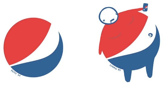
But there is such a thing as a truly awful logo. Some people think Pepsi’s logo is not so great:
Doughboys Pizza has cleaned up its logo since this one. I know what you’re thinking – no, with a designer!
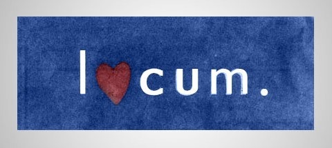
Also, today it’s important to make sure your logo isn’t offensive in and outside your own borders and culture. This one from Locum in Sweden is particularly unfortunate.
I tried hard to confirm this last one because it’s a pretty unbelievable fail. From all I can find it appears real, although it may have been a company holiday card design rather than an all-year logo. The company currently has a more regular typographic mark, which now looks more like I o cum. So, better.
Now, you know a firm with just this specialization, because you know our name and you know our logo.
Behavioral science tells us that most marketing strategies overemphasize motivation. Moderately motivated people are more likely to do what’s easy than highly motivated people are to do what’s hard.
Ease beats motivation. That explains the fate of most New Year’s Resolutions.
Google’s competition had gone in for massive cross-selling and indexing. Yahoo and Netscape’s homepages were cluttered with links.
Behavioral economists confirm what direct marketers long knew – choice depresses response.
Why, because simple is easier, and ease is the single most important factor in designing for behavior change.
Google had a simple search bar, a logo and that’s it. Faster is easier.
And, the distance in time between action and reward increases effectiveness geometrically. That’s why Google uses a little of its precious homepage real estate – to tell you exactly how many nanoseconds it took to get your result.